How to Know It's Time for a Rebrand
Remember that scene in “13 Going On 30” when Judy Green says a redesign is a death sentence? Clearly, not the case for Jennifer Garner in the movie, and definitely not the case in real life, even if you don’t end up bagging a cutie like Mark Ruffalo.
The truth is, redesigning, and rebranding, can mean a lot of different things. In some cases, you start completely from scratch. In others, you maintain certain existing elements of the brand – perhaps a well-recognized color scheme – while changing others, like a logo or typeface.
The key is, whether a rebrand is just a small element or the whole kit and caboodle, you need to have a clear purpose and goal to ensure your new design aligns with your messaging.
So, what are some situations that might call for a rebrand?
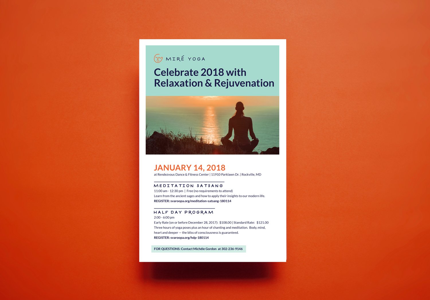
1. Your Branding No Longer Represents Your Mission
This is probably the most straightforward reason because it can be easy to recognize. For instance, if your programming or audience has changed since you first started, rebranding might be the best, clearest way to make sure you’re reaching your current audience and communicating what you do. I always recommend that my clients keep their logo marks broad and open to interpretation in case such shifts happen. While it’s important to anticipate evolution in your organization, it’s impossible to predict all the ways your intended – and unintended – audience may or may not respond to what you have to offer. Updating your visuals can be a clear, impactful way to commit to your new direction.
Example
My client Mire Yoga needed a new design that clarified and communicated their message, setting it apart from the numerous other local yoga studios.

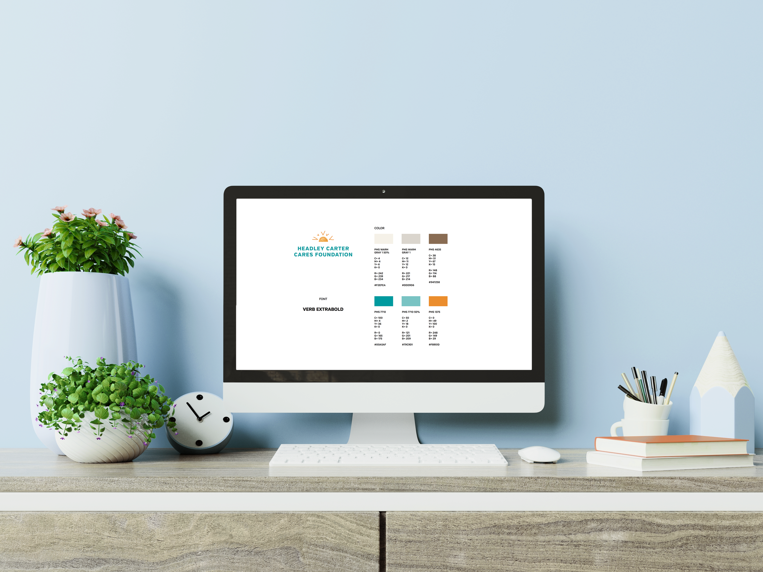
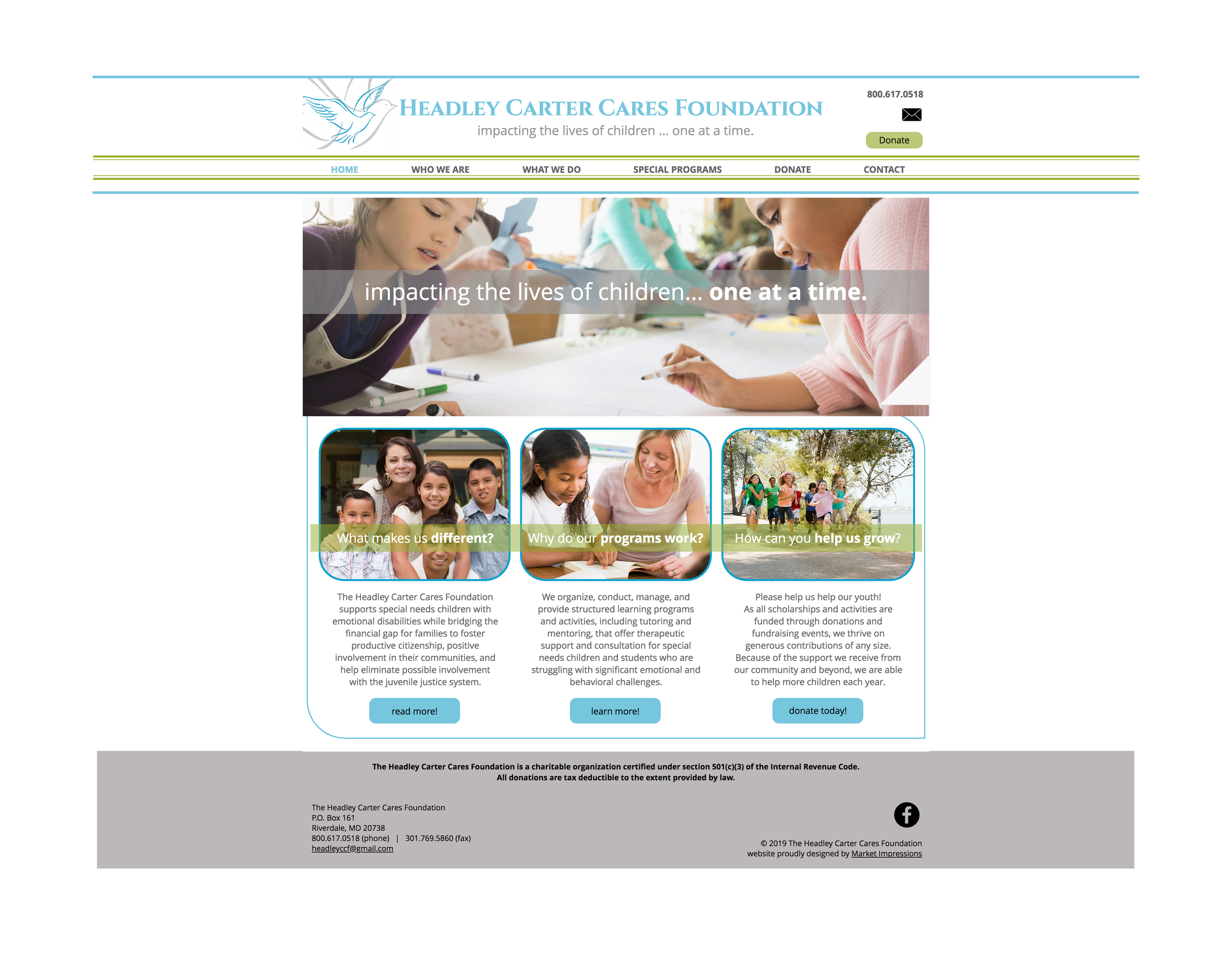
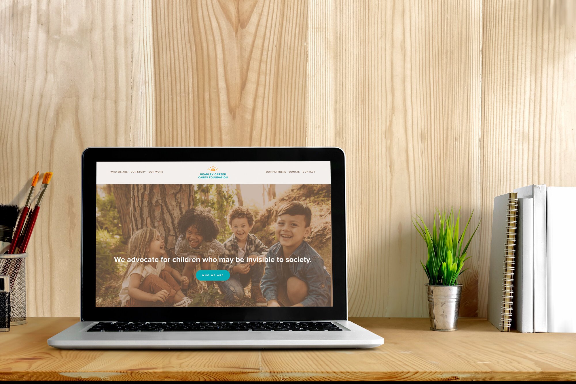
2. Your Branding is Getting Stale
This one can be harder to pinpoint, especially if you have a certain affection or attachment to your brand. But sometimes, you need to freshen things up a little, you know? Like, we all know I love my stripes, but if I literally wore a navy and white striped shirt every single day, no matter the occasion, people wouldn’t think, “Oh, this is Christy’s signature look,” they would think, “Why does Christy not own any other clothing?”
Likewise, I often see organizations get stuck in a very specific design that leaves no room for flexibility. Ideally, a brand’s design is adaptable, allowing for space to create different visuals for different elements of your work, e.g. events, conferences, fundraisers, programs, etc. When a brand lacks flexibility, the design becomes rigid. Over time – or sometimes quickly – that gets stale. Ongoing communication is key for avoiding this downfall. Check in regularly with your staff and your audience to see what is and isn’t working for them. Remember, a rebrand doesn’t always have to be a complete overhaul. Your design may just need some tinkering while keeping the same foundation in place.
Example
This is what happened with my client Headley Carter Care Foundation – over time the design began to feel dated, so we collaborated on a refresh that gave the brand a more updated, contemporary feeling.
3. You Need an Upgrade
Here’s something I see with a lot of new businesses, when people are especially excited. Eager to get started, folks will hit the ground running and quickly pull together a brand look themselves or through a low-cost option that doesn’t have a lot of strategy or individualized attention. I actually think this is a perfectly fine approach to get things off the ground and just get your forward momentum going. Once you have a few more ducks in a row (maybe a bit more of a budget?), you’ve clarified your mission, and you want to build up your reputation, that’s when it may be time to call in a professional. With some more experience under your belt, you want a professionally designed brand that reflects your skills and value. In situations like this, I’ll use elements of the initial brand design – well-loved colors or fonts, or a general feel or theme – and give the whole thing a boost to work better as a memorable visual language over time.
Example
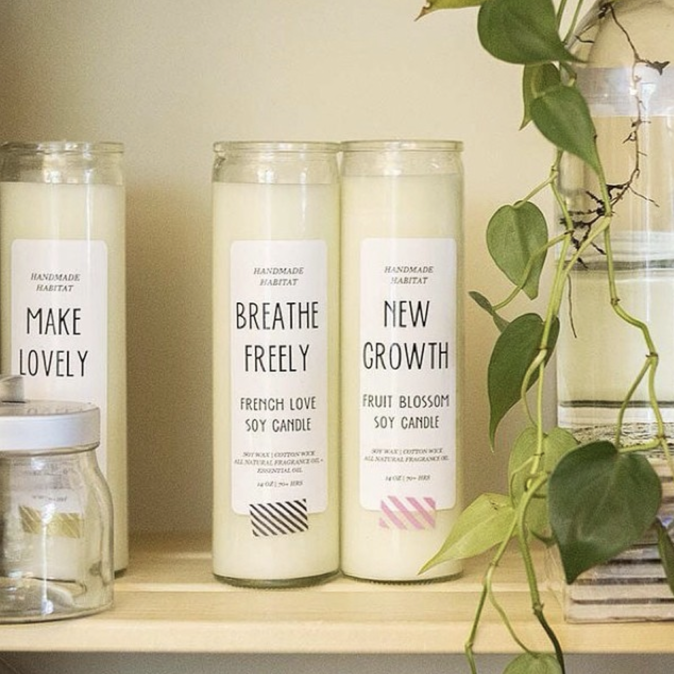
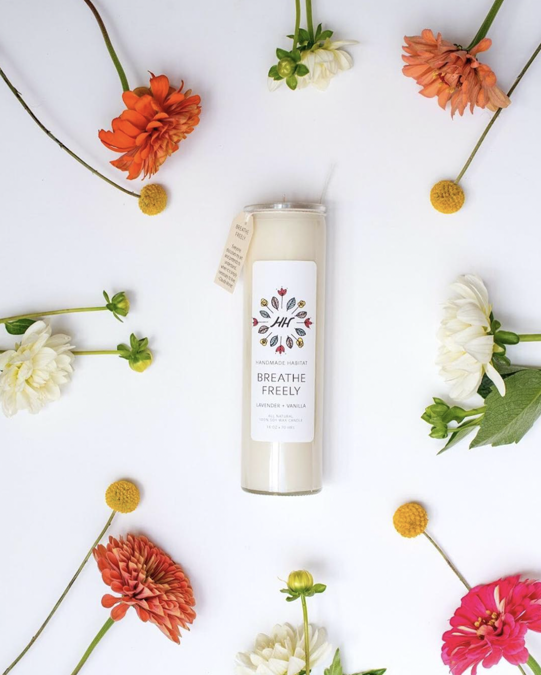
A good example of a project that involved upgrading a self-created design is my work with Handmade Habitat (though I will say Amina’s DIY branding was a pretty snazzy jumping off point!)
CHANGE MAKER OF THE MONTH
This month, I’m spotlighting and supporting the Invisible Disability Project, a social/cultural movement and an educational media project that consciously disrupts “invisibility” imposed upon unseen disabilities at the intersections of race, class, gender, and sexuality. As a person living with an invisible disability myself, I think the representation and advocacy work the Invisible Disability Project does for our community is incredibly valuable.